
By John Dewhirst
The current Bradford City crest was introduced – without any form of supporter consultation – in 1991 at the behest of the incoming chairman, David Simpson. Ever since Stafford Heginbotham assumed custody of BCAFC in 1966, changing the crest has been considered the prerogative of an owner and invariably new designs have been associated with regime change at Valley Parade.
Another theme has dominated the history of Bradford City logos. Namely that design was always done on the cheap and without the expense of engaging a professional graphic designer. The story of BCAFC crests has typically been that of do it yourself affairs.
With regards the Bantam identity, past designs also attest to the fact that in the post war period no one at Valley Parade seemingly knew what a bantam looked like or how to draw one. Thereagain, the record of past designs also demonstrated the difficulty of actually drawing a distinctive bantam as opposed to a generic hen and the current bird for example resembles a pullet (or to be less charitable, a pigeon). An aside to this is that bantams were also known as fighting birds. The original depiction in 1909 of a bantam in club iconography featured a breed that had had historical association with cockfighting, not dissimilar in shape – although not in size – to the cockrel of Tottenham Hotspur. Needless to say in the modern era it has not been an option for BCAFC to introduce such a design and not simply because it would be confused with the Tottenham identity.
At this point it’s probably worth remembering how and why the club originally encouraged its Bantam identity because whilst this has tended to be overlooked it is arguably pretty fundamental to how best to design a bantam crest. (The full story can be read here.)
The abridged version is that the nickname was adopted in November, 1908 at a time that the club was fighting against relegation in Division One. It was then popular for clubs to adopt an animal identity and the ‘Bantams’ nickname was chosen by the BCAFC leadership to rally support and encourage a fighting spirit in the team. A bantam identity was ideally suited to reflect not only the underdog status of the club and its plucky attitude but also the fact that bantams were known for colourful plumage, in this case claret and amber.
In addition to the Bantam themed crests there have been two other generic logo styles adopted at Valley Parade going back to the days of Manningham FC in the late nineteenth century. Prior to the bantam revival in 1981 for example there was a BC AFC monogram design introduced in 1974 and not dissimilar to the logo of the Bradford Metropolitan District Council introduced in the same year. A classic monogram in the Rangers style was also adopted by Manningham FC prior to 1903 as well as the Bradford City Shareholders and Supporters Association in 1922. The dominant identity however was the Bradford civic shield with boar’s head atop that was used by both MFC and BCAFC.
From 1908 BCAFC (as well as Bradford Park Avenue) then adopted the new Bradford Corporation coat of arms. City abandoned this in 1966 but it continued to be used by the local authority until 1974. (The full history of City crests can be read here.)
In 1966, Stafford Heginbotham reverted to the simplified civic crest and replaced the detail in the shield with a BC AFC monogram whilst retaining the boar’s head. Controversial at the time was his parallel introduction of the City Gent character which eventually proved extremely popular with supporters who ignored the fact that it was actually a representation of Heginbotham himself. And for the record, its introduction was never put to the vote.
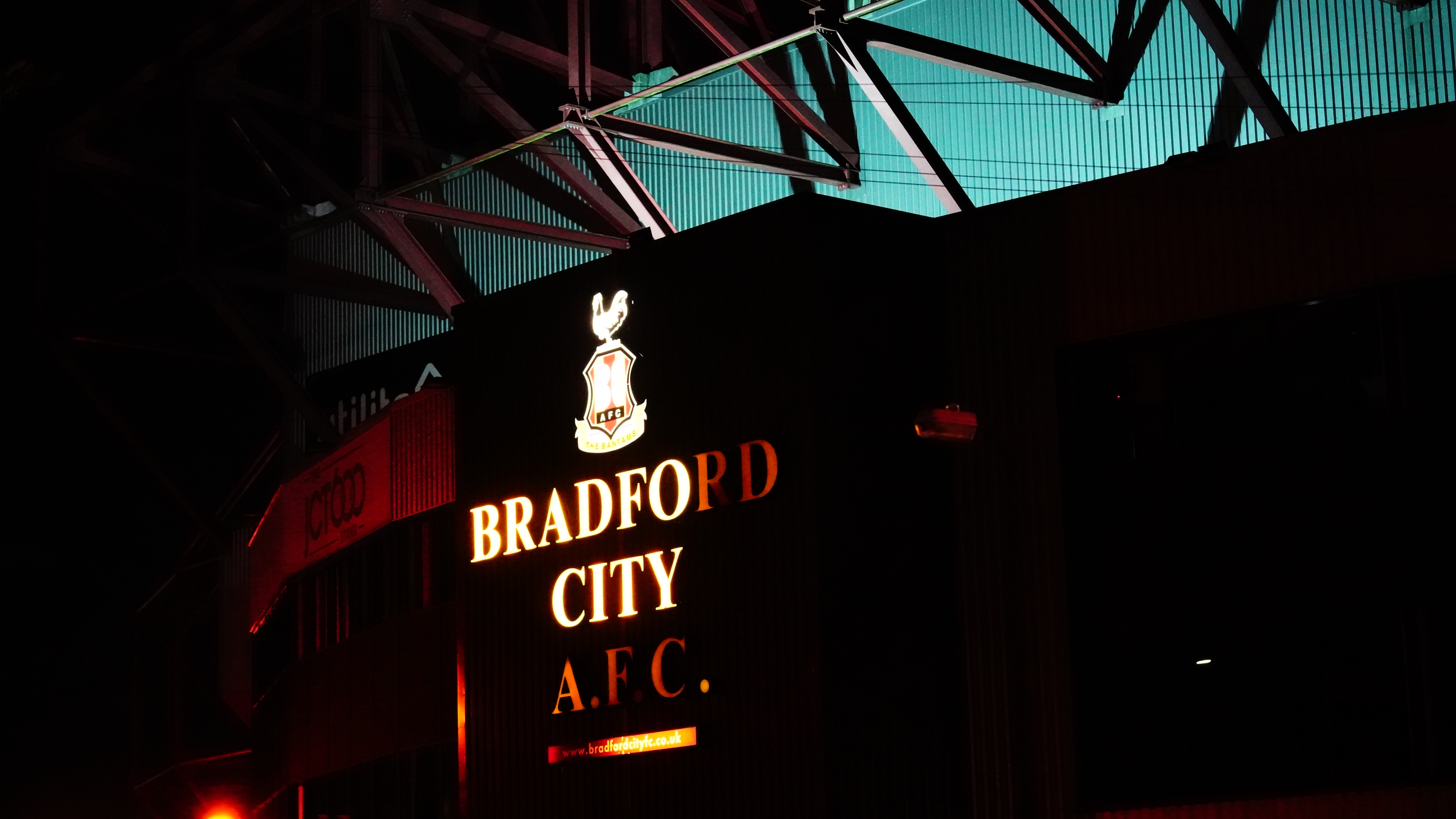
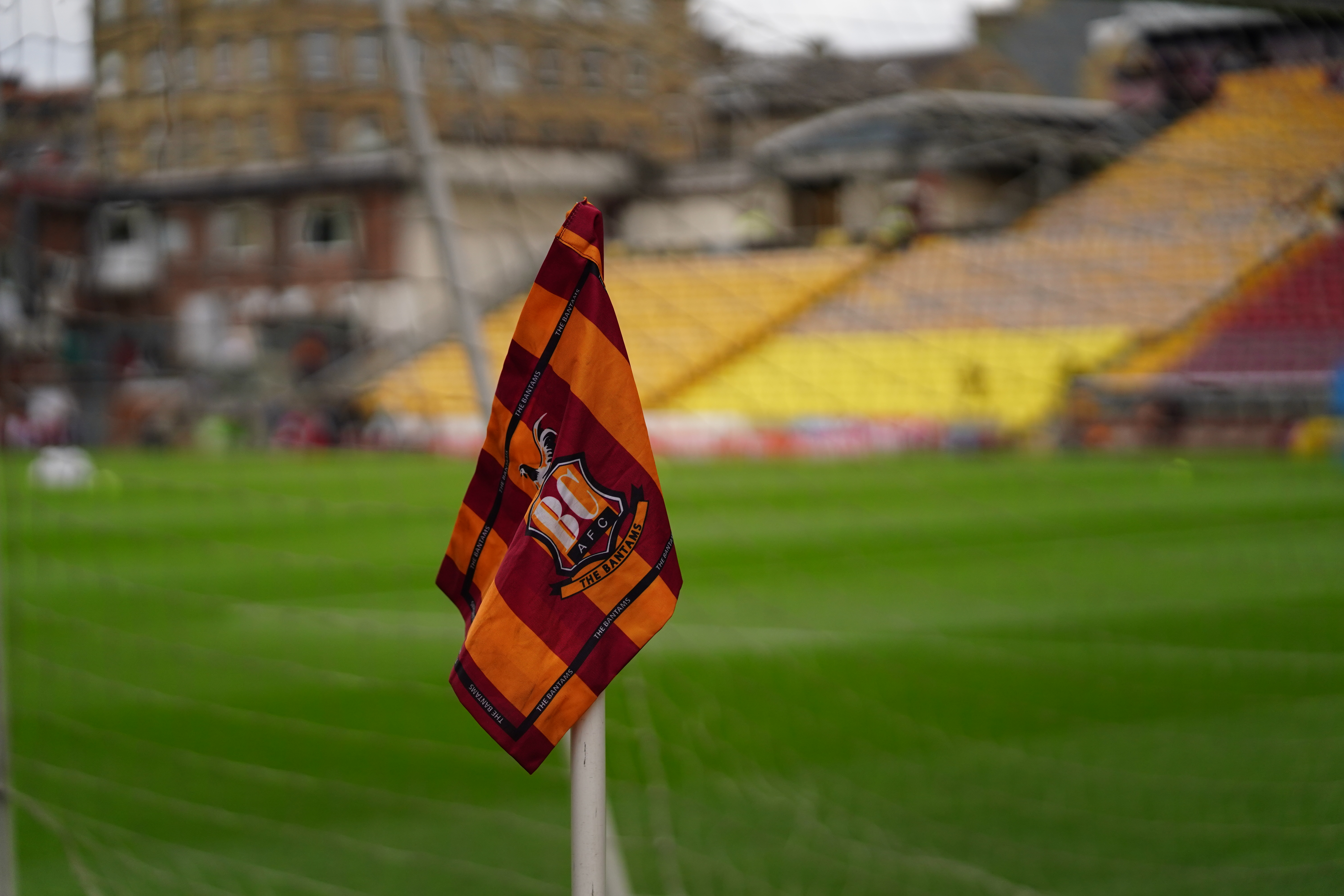
The current crest
The current crest was essentially a fudge in 1991. It took the shield from the preceding boar’s head badge and tidied the way the BC AFC lettering was presented. (Look closely at the original ‘B’ and ‘C’ monogram and you will find an optical illusion. Whilst arguably fitting for a Bradford City identity the configuration was nonetheless unsuited to commercial application.) At the top of the shield, the boar’s head was replaced by a bantam and to remind us of the club’s nickname, a ribbon was added at the bottom with ‘The Bantams’ inscribed. The ultimate fudge was that the bird was depicted in white, presumably to avoid a colour clash with the claret and amber stripes of the shield and to make it stand out. Fifteen years later we then had the almost arbitrary addition of a star to depict our FA Cup victory in 1911.
At the time of the crest being introduced in 1991 there was controversy about dropping the boar’s head and the civic identity of the club. Had it been put to a vote amongst supporters I doubt that the boar’s head crest would have been abandoned. In the ten years prior to 1991 there had been no less than four other different crests and most of us took the view that it would be rotated again sooner than later. I don’t think that anyone could have imagined that the crest would still be with us more than thirty years later and that people would be passionate about retaining it.
The fact that the crest has survived so long has had less to do with the quality of its design as opposed to the fact that the club has never been able to afford its replacement. In 2003 for instance, the commemorative centenary crest was drawn by the wife of the then chairman by simply adding a second bird in the same design to the side of the shield. The reason that the club embarked on a change process in 2022 is that it has got to the stage where the cost of not doing anything about the crest is greater than the expense of redesign.
In the background at Valley Parade the club has rightly invested in its online marketing capability by engaging dedicated staff and it is therefore somewhat anomalous that the existing crest should be retained. The extent to which the current crest is no longer fit for commercial purpose has been sufficiently documented in the club presentation. Suffice to say BCAFC does not even have copyright control over the crest. In turn this gives the green flag to the street vendors selling pirate merchandise outside the ground which in the bigger picture is another instance of the club being deprived of revenues to invest in players and/or subsidise cheap season tickets.
Bantam redesign
In November, 2021 the club engaged a professional graphic designer with a portfolio including football club rebrands (his most recent of which having been a new crest for York City) and his remit was to introduce a new Bantam identity for BCAFC. He approached me six months ago for examples of historic club iconography and I provided these to him to give some background on previous designs.
The parameters of his brief were determined from online supporter feedback provided by just under five thousand respondents. The general consensus was to include a bantam, a shield, claret & amber and a star. Although a majority had requested the removal of ‘BCAFC’ it was decided that this should be retained as it aligned with social media marketing and the use of the #BCAFC hashtag that provided differentiation in relation to Birmingham City or Bristol City.
Notable is that only a small proportion of the respondents (myself included) stated a preference for a return to a boar’s head crest. In part I believe that this reflects the demography of the club’s current support who have no memory of the old civic identity. However the club made no secret of its own preference for the Bantam identity. Whilst sentimentalism might argue for the old boar’s head to be revived it is difficult to argue with the commercial logic of focusing on the Bantams brand.
A number of feedback sessions were held in the 1911 Lounge at Valley Parade at which supporters were asked to give their opinions about the design of a new crest. I attended one of those in August, 2022 at which around 20 others were present and to that extent I have had no other involvement in the determination of the various designs.
From originally being sceptical about the process I cannot fault the approach taken by Luke Flacks, BCAFC Director of Brand, Marketing and Media or Chris Payne, the designer. Both have been professional and thorough. Incidentally I referenced Chris with a couple of contacts, one in the US and the other being Martin Routledge who is co-author of The Beautiful Badge: The Stories Behind the Football Club Badge, Pitch Publishing (2018). Martin is something of an authority on club badge design and he rates Chris highly. And in response to the suggestion that the club poured tens of thousands of pounds into the process I am reliably told that the fees paid to Chris Payne were anything but.
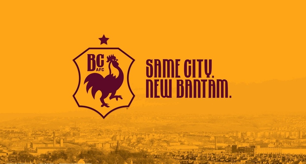
The proposed new crest was revealed in September, 2022. I thought that this first design did the job notwithstanding my gripes about the star or the size of the letter ‘C’. (I wrote this piece at the time.)
In the round these were minor issues and I considered that Chris successfully depicted a bantam that captured the essence and colours of our identity. I felt that his design was impactful and benefited from its simplicity which had advantages for branding applications. Given the constraints that he faced in terms of satisfying supporter feedback I think he did a good job and probably as good as could have been expected.
In October, further feedback was invited from supporters although less than three thousand responded. Whilst a clear majority were happy with the shield and the star, 60% wanted refinements to the first design although only 47% wanted to retain the existing crest.

This prompted two new designs to incorporate the feedback and supporters were asked to vote in a second survey on their choice. The results of that final ballot were announced on 8th November: just over 5,000 votes were cast of which 61% voted to retain the existing crest; 26% choose Option ‘B’ and just 13% Option ‘A’.
Ultimately the process became design by committee. Someone tweeted ‘If you ask a committee to design a horse, you get a camel‘ and frankly I believe that that is what happened. Not surprisingly, the second round of designs were weaker and as a consequence, in the second survey people voted instead to retain the original crest.
Take design ‘B’ for example. This responded to the wish for stripes to be incorporated in the shield, the inclusion of a ball and the bantam facing the other way. And what did we get? The club identity of a bantam (a small, plucky bird denoting underdog status) depicted as a giant rooster stood on a pingpong ball with white plumage instead of claret & amber. The depiction of the bantam in ‘B’ was better than that in the current crest but still fundamentally adrift of what the bantam is supposed to represent as the club identity whether in terms of colours, proportions or the fact that a plucky bird is more likely to be facing forward (ie facing opponents) than backwards. As regards design ‘A’ this was another fudge with the drawing of a striped tail and the additional request for ‘1903’ to be included in the design.
We could go through endless rounds of feedback and new design iterations but I can’t see how it would provide a solution that keeps everyone happy. There are only so many ways that you can draw a bantam and with each successive version there will be the request to add more detail and undermine the original concept. Hence we are left with the existing crest that is far from universally popular and long overdue replacement. Many of those who voted to retain the current crest for instance were only doing so because they disliked the other options and it cannot necessarily be interpreted as positive endorsement. The fact remains that the majority of season ticketholders did not engage with the process, presumably on the basis that they were indifferent about the issue of a club crest.
All of this has been a frustrating exercise and in commercial terms for BCAFC, a big disappointment. The irony is that the club had engaged a designer to manage the project. The failing does not appear to have been a lack of consultation, it is that the professional designer has ultimately been overruled and his recommendations for a composite branding solution rejected. I would suggest that it has been a case study in the futility of ‘design by committee’. In the historic context it can be taken for granted that neither Stafford Heginbotham nor Geoffrey Richmond would have ended up in this situation.
During the process both Luke Flacks and Chris Payne have made sensible recommendations and for instance made valid arguments that contradicted the sort of design that I had originally wanted and felt quite strongly about. In the end I have given them the benefit of the doubt and respected their judgement because I don’t have their expertise and I don’t have their responsibilities. On the one hand the club can be commended for its commitment to inclusion but whether that has resulted in the optimal outcome is highly questionable. Either way this is not the recipe for a future change of crest or indeed commercial decision-making generally. The badge saga is a prime example of where a controversial decision has to be made and accepting that in the short term at least not everyone will be happy.
At the end of the day you don’t get a dog to then do its barking. To take the club forward I’d suggest that people at Valley Parade need to be given the space to get on with doing their job whether that be the team manager, CEO, a graphic designer or anyone else with responsibility to deliver. Difficult decisions need to be made in any organisation and the people making them have to be encouraged to do so – and respected for it.
Categories: Opinion
 Thanks for your support, have an amazing summer
  Fascinating, isn’t it?
  What’s next for Bradford City?
  The play-offs and Bradford City – a potted history
Excellent synopsis of the whole issue. City are to be commended for having the guts to listen to supporters views and go with them but imho I think we’ve ended up with something not fit for future purpose.
I definitely preferred to keep our current badge.
Although I wouldn’t have been averse to incorporating an outer shield.
Especially if that minor tweak, could have provided our club with copyright control.
CTID
Excellent summary
I heard that a consideration was the unreliability of the badge in the digital printing world.
The Boars Head – but with the missing tongue – found in Maningham would be a better than the perpetual underdog always battling against the odds.
A good interview on the City Vent podcast.
So basically, like the remainer attitude , you dont want to accept that 61% of people who actually fought their way through the blurb and past comments, made by you possibly? That the current badge, not logo! Is somehow ‘broken’??? What the hell does that even mean?? . People voted for the current badge because of history, it’s been around longer than several league clubs have been in the league, and no2 because the alternatives were laughably awful. By all means change the bantam on the badge, i dint think many would argue too much about that, but throwing away over 30 years of club history is not what supporters want , and the 61% that votedfor retaining our badge wiuld have been around 80% if the vote had been for all supporters.
In a referendum, how people vote is in response to the question that is asked of them. In the first survey only 43% of respondents wanted to retain the existing crest. In the second survey a clear majority expressed a preference for the current crest / badge / logo in relation to the two proposed alternatives.
With regards why the club embarked on a change process you need to ask those at Valley Parade as to why they consider the current crest to be broken. I don’t think that they helped themselves by not making this much clearer and by relying on a lengthy presentation to make their case. Clearly their reasons were not heard or understood.
The decision to stick with the current crest has been made and I’m not contesting it.
John, my understanding is that the first survey was in late 2021. It’s focus was about what features were important to fans for inclusion in the new crest. The 43% choice to retain the existing crest came from the second survey which was last month.
Phil, you are correct about the FA regulations to protect the heritage of football clubs but strictly speaking the rules were not introduced until the start of the current season. It is therefore inappropriate to infer that the club acted irresponsibly or in contravention of the rules when it initiated its consultation process last season. Besides, by virtue of the fact that the club has actively sought feedback from supporters in the last couple of months through the online surveys confirms that it has acted wholly in accordance with the spirit and the letter of those regulations. That the club has announced it is sticking with the current crest in accordance with the outcome of the last survey further demonstrates this point. I think the general consensus is that had the design of alternative options been more impactful and less ‘busy’, the outcome may well have been different.
John, it’s a shame that Sparks never made reference to the FA requirement to meeting the FA’s requirement of fan involvement. Instead, Sparks implied this was all hid idea to include the fans in the decision making. Therefore,false impression.
While the club can be commended for the approach of engagement the execution was lacking.
It ended up being mismatch of various subjective views without true ownership.
I believe it was Henry Ford that once said ‘if I’d asked people what they wanted they would have asked for a faster horse’.
Rather than being data dependent they should be data driven and the fan data should be a factor in their decision not the decision maker.
Someone in the organisation should be making the decision of what is best for the club and I don’t believe in this case they have done so and been brave enough to make a brave decision for the greater good.
Inclusion of the fans is a FA requirement when it comes to crest or home colour change and requires a fan vote on approval. It’s a shame that neither the Club or the media have disclosed this FACT. Ultimately, this is a public relations mess that Ryan Sparks owns. Surely, if due diligence is important the first question in the survey should have been about the fan interest in a crest change.
For once in your life, Woody, you are 100% correct
I didn’t know I’d ever been wrong. Lol
Have worked in communications / marketing / PR / fundraising for 30 years, including corporate visual identities, and think City have ‘missed a trick’ here – option B (but omitting the letters / date / star / shield) is strong and simple.
Totally agree, that simpler is better. I also think that Sparks did a very poor job of explaining in simple and straight forward terms the importance of a crest change.
Thank you, Phil W. Think Ryan Sparks is doing all right generally, maybe cut him some slack.
Not sure he did a bad job of explaining. If anything the design process of which he was part of went too far overboard creating something that should have been far simpler.
I think this is missed opportunity by the club. We have professionals who have built careers in marketing and branding. Those who listened to the excellent CityVent podcast would have got an appreciate as why the badge needs to change from a commercial point of view. I would have left the decision to them and accepted their judgement. It’s not as if we the fans pick the club kit design every season.
My suggestion to club is change/tweak the badge every 5-8 years but choosing the previous crest is not give as an option. I would say for now we leave this old crest in place for the next 18 months to respect bodged process but for season 25-26 we are get a new crest period. Time to move on.
Sorry meant season 24-25.
A really interesting and in depth write up as to the history of the clubs ‘badges’. From my own personal opinion based on being interested bystander in how other clubs had changed their own branding, i wasn’t against a refresh or even something that was essentially a new approach as per the boars head in the 80s (but not the boars head in this instance) but was quite happy to keep the current design.
But having the read the 70 odd pages of marketing, it felt like i was reading a pitch from the apprentice. And the design process stance taken by the club seeemed to hinder a new design rather than aid it, kinda trying to appease everyone but limiting the designers poetic licence. And from that we, in my opinion, ended up with what are pretty poor looking redesigns that reminded me of of a fried chicken shop logo than something to do with our football club. And it was the reason i voted to stay with the current design. Not because as a 50 year old i feared change like some ludicrous comments on social media by younger elements of our support. Just a decision based on what i thought was poorly designed branding based on a flawed design process. If the designer had been given more of a free reign, who knows? I’d have probably voted differently.
Exactly Al,
People are reading too much into this.
In my view the alternatives were hopeless. I don’t particularly care that the crest was created by professionals – they can mess up as much as the rest of us, and I don’t care how the design was developed. The simple fact is that they came up with (IMO) a pretty poor design.
Whilst I understand the copyright issue, surely it was ever thus. There’s arguably less “hawkers” on Manningham lane than there were in decades past. Whilst one could argue they take money from the club I would opine that the add to footballing culture in general and City culture in particular.
The City Gent, BFB, WOAP and countless other non official club organisations add to the culture of supporting City and we are richer for it…
A good article but I think you may misunderstand why many chose to maintain the current crest, certainly among my circle of family and friends. Not because it’s the greatest crest ever but because the ‘new’ versions offered were so incredibly, incredibly bad. I would not buy merch with A or Bs crest for fear of ridicule, I found them to be cheap, childlike and lacking class. Offer a stylish and grown up alternative and I could be persuaded to vote for a new crest.
I don’t think we are disagreeing.